Is sustainable design ugly?
Or can sustainable design aesthetics look and feel "high-end" and "premium"?
A question I get frequently asked by students in interviews or surveys is: “Do you feel making something sustainable degrades or takes away from the quality of your designs or branding?” Besides the obvious fake dichotomy that if something is sustainable it has to be ugly (this isn’t 2001 anymore), I think that in fact, it’s incredible easy to make sustainable design luxurious.
What makes something look luxurious?
What’s considered luxurious changes on the decade and cultural preferences. There isn’t one definitive answer, but I’m going to focus on what I’ve identified as being trends in the current luxury packaging and product market and the design decisions that can be made to achieve those aesthetics sustainably. Some of the key areas we’re going to focus on are materials, texture, and embellishments.
Paper is a Design Decision

Print design can be overwhelming when you first get into it. But after you familiarize yourself with it a bit, it’s like the world of your design doubles. No longer do you have to rely on film-grainified Photoshop mockups; texture, nuance, durability are now literally right to your fingertips. Choosing paper stocks can be hard, but it’s my opinion that as designers we shouldn’t be leaving this up to printers or clients (not that we can’t ask and incorporate their expertise or input! especially when it comes to the practicalities of printing…) but that this is an area we should take initiative on ourselves as designers. It’s a huge aspect of the sustainable design framework and one of the most important decisions you can make as a sustainable designer. It’s through paper stocks that we can emphasize a sophisticated, high-end look and feel. Paper is a tactile experience; it’s not just about how it looks or performs. It is also about how it feels to handle, be that a business card or a carton package.
Recently, a lovely student in our Green Design Course asked about luxurious print collateral options for her client, who was a local bakery, that was looking for a sophisticated look and feel. We recommended Mohawk Straw line: not only is it very sustainable (made out of reclaimed straw from farmer’s fields that would have been otherwise burned), but it was a direct in direct brand alignment: wheat for bread, straw for marketing materials. The paper stock also has a beautiful flecked fibre (pictured above in Bathing Culture’s packaging), and feels gently textured, immediately elevating the design. The design of Bathing Culture’s packaging is gorgeous, but it’s really the paper stock that brings the design to another level of beauty. (Side note: It does feel a little weird describing a capitalist product and mass-produced packaging as ‘beautiful’, but that’s a discussion for a different time.)
Bathing Culture also took their packaging one step further, realizing that packaging is an important emotional and intellectual touch-point to consumers, as much as it is a physical and visual one. They described the paper stock’s environmental benefits directly on the product packaging so consumers can read and evaluate it alongside the product’s features. Brilliant, and an important decision we should all strive to implement in our packaging design work. The more we can talk openly about transparent sustainable choices (not just a throwing a certification without context on it), the more consumers can begin to understand legitimate claims to sustainability compared to greenwashed ones that are vague and non-specific.
Medium is the Message
Paper companies are starting to realize the importance of paper stocks being something designers specify in addition to printer’s carrying these stocks. Mohawk recently reworked their brand messaging and paper lines to organize their sustainable options under the theme “The Material Is the Message”. I think this is both a genius move, and makes paper stocks a lot more accessible to designers like us. For sustainable design, the material very much is the message. I often see beginner sustainable designers focus on things like font choice or ink colours, but truly the most important thing we can do to have a large material impact on our planet’s health is to choose a sustainable material for any print design project we take on (when possible, of course).
When clients come to us, they’re (ideally) coming to us for design support because we are the experts in creating a brilliant design that will perform well for their business needs. Paper stock choice and material choice needs to be part of that expertise and guidance we provide to our clients, even if it’s just for their next run of business cards. We shouldn’t let this choice fall into a default space where clients or printers make automatic choices based on what’s cheapest, not what’s best for the project and for the planet.
Case Studies
I wanted to pull a few stunning case studies for sustainable materials to emphasize the “Medium is the Message” in different areas other than paper stocks.
The first example is Treaty’s use of innovative, alternative materials for their “styrofoam” supports.
“Mycelium networks can take on any form and once they colonize a form, it’s incredibly durable, insulating, and flame resistant”—properties which make mushrooms an ideal substitute for Styrofoam and plastic. - Loney Abrams via Vogue Magazine
The founder of Ecovative, Gavin McIntyre, breaks down the mycellium packaging’s sustainability:
Mycelium products biodegrade within a month in a home compost, meaning they don’t need to be sent out to a facility. …You could technically cut up the packaging and put it out next to a tree or—though [McIntyre] doesn’t recommend this—a local body of water, as the product is safely marine compostable and used to protect scientific buoys in oceans around the world by the National Oceanic and Atmospheric Administration.
Even though the product is best for home compost (randomly littering packaging around isn’t cool no matter it’s compostability status), it poses no potential harm to the environment as it breaks down, unlike plastics which can leech chemicals/toxins into the groundsoil and water as their break down (plus the microplastics issue).

Part of Treaty CBD’s brand ethos is a commitment to healthy soil. When asked about the choice to package their CBD oil in mycellium, the founders viewed it as a natural fit;
Dobson’s team grows hemp as part of a dynamic crop rotation alongside grains that supply flour to local bakeries, livestock feed for dairy farms, and rye and hops for brewers and distillers. Part of the mission of Hudson Hemp is to develop soil that relies on nutrients that come from the farm itself; since mycelium goes hand in hand with soil health, it was already in mind. - Vogue
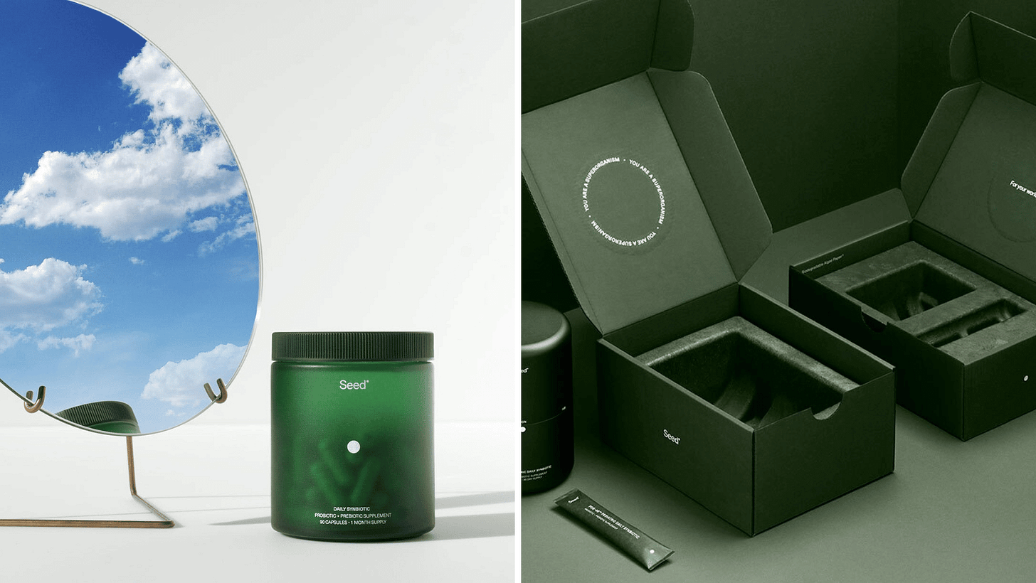
Treaty was also inspired by Seed, who was an early adopter of mycellium packaging. They have since changed to use algae-based fill for their packages, but Seed is often an example of sustainable packaging I mention to every client as the “gold star” for doing everything right. Transparency on their website, glass bottle with refill system for the bottle, and sustainable carton and fill choices.

It all comes together into a gorgeous, high-impact design that I think anyone could pick out of a line as being “high-end” in aesthetics.
These packaging choices, materials, weights, textures, look are all something that impacts our digital work when translated into print, and something that impacts the brand’s impact and its resonance with consumers. To leave these aspects out of our design or leave them to defaults is doing clients a disservice.
So how do we create this sense of luxury? I’m going to break it down into 3 key aspects: texture of the paper, paper embellishments, and die-cutting.
Textural Tactility
Considering paper texture is one of the easiest ways to elevate a design project.
The variation in the paper textures creates a unique experience to touch as it’s distinctly more tactile than smooth, cheaper, flat papers. If I were to hazard a guess, possibly part of this is how prevalent plastics are in our society. It’s not often plastics are associated with “luxury”, as it’s well understood it’s cheap to product, makeup and skincare might be one of the few areas where plastics are able to be pawned off as a “luxury” packaging design.
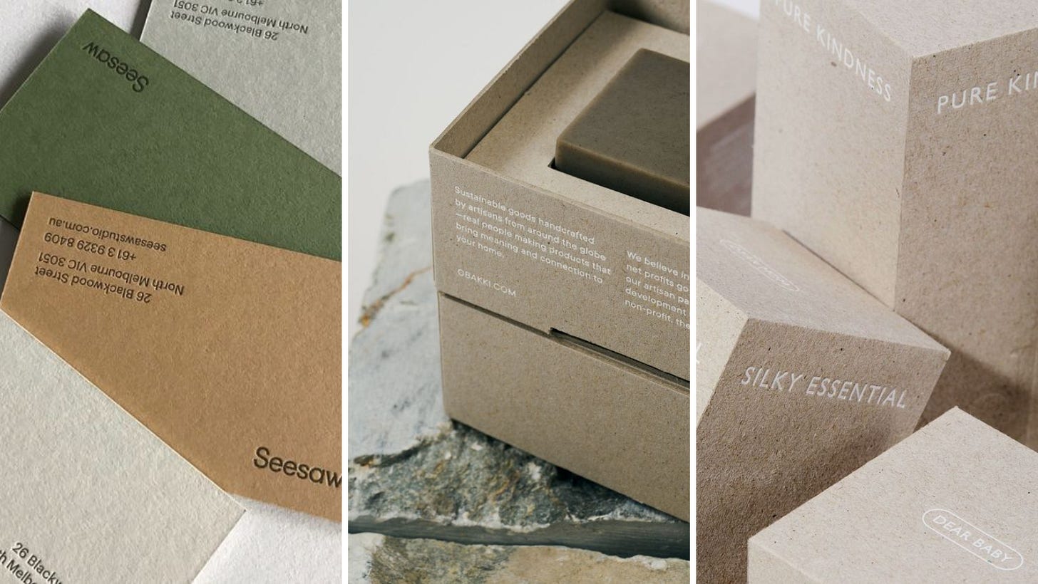
More luxurious sustainable stocks often feature unique fibre and grain patterning like the above examples.
To go beyond simple stock texture, one can also consider really amping up the tactile experience for the user with brand elements that are embossed/debossed into the paper.
By investing so heavily in the design of the packaging, it shows attention to detail, as well as love and care that went into the packaging design, and reflects well upon the product enclosed inside. These additions to the cartons make them special: they’re not just pretty, they’re nice to touch (and maybe display, if that’s your thing). When packaging can sometimes be an afterthought, this next level of elevation can skyrocket a product into the premium realm, and also justify the additional cost increase: if the packaging feels expensive, consumers are more likely to justify the additional costs of the product as they’re buying the experience of the whole unboxing and product use, not just the product itself. Often packaging for luxury products can also be a draw for consumers as high-end packaging can reflect their lives, values, and the aesthetics and designs they want to surround themselves with. It also conveys a message to the people around them about their identities.
These additions to the paper do not impact recyclability at all, and are some of the most sustainable paper stock embellishments you can add.
A third option, related in detail, is considering using letterpress or blind debossing/embossing on your typography on your packaging or print collateral.
This is a technique often used for luxury invites, such as wedding invitations, but is also common on high-end business cards. It’s an amazing way to make your marketing collateral (subtly) scream “I am professional, I care about how my marketing materials appear, and whatever my product/service costs, it’s worth it.”
Die-cutting Delight
So what about when paper stock isn’t enough? You want to go further! Consider the unique and expansive opportunity of diecut elements to the packaging. This can open doors for brand recognition while still being sustainable. It does involve trimming excess material outside of your diecut area, however, this is much more sustainable than adding on plastic coatings to your paper, as the cutoffs are just simple recycled as pre-consumer waste. Creating windows or shapes into your design can hint at bottle design, brand ethos, reveal photography or a brand colour. It creates a unique branded impression, all while retaining recyclability and compatibility with sustainable paper stock options.
Grounded Textures and Tones
Where does this association with natural fibres/looks to high-end aesthetics come from? My theory is that it’s something we’ve been associated to believe through many different avenues, but primarily interior design and fashion trends.
Many interior design magazines feature natural textures (stone, jute, clay), inclusion of green/plants as decor and ambience, and a focus on wood. Naturally, these are millionaire/billionaire houses. One of Bill Gates’ houses is made entirely out of 500+ year old-growth trees. But ethics aside, these textures and natural elements are bringing in high-quality elements as natural fibres and materials are higher-quality and generally more durable in a practical sense than plastics.
These skincare and promotional photography for Kim Kardashian’s brand, you can see some of these aesthetics in use: monochrome neutrals, debossed logos, stone props for the bottles. The complete collection retails for $800 in a bundle (Regularly price $935 USD… lol). This skincare line is “refillable” and “eco-friendly” and while I don’t have space to get into why that’s greenwashed here, that’s total bullshi*t. (Let me know if you’d be interested in rant-style debunks of why certain brands or packaging aren’t actually sustainable).
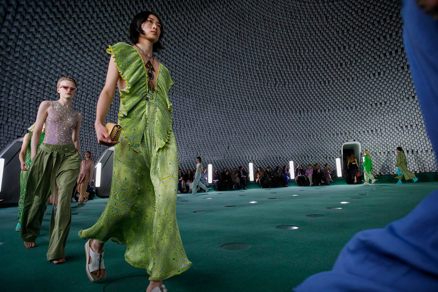
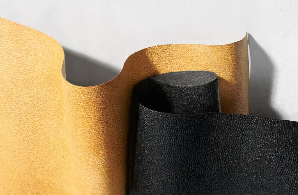
We can also see this in fashion-house trends. Stella McCartney’s sustainable lines have been hitting runways for decades. Her work focuses with a priority on natural fibres, reclaimed materials, and she is currently involved with Mylo the development of a mushroom-based “leather”.

There are class implications of color and texture. These interior design photos and Kardashian packaging (and oh lord, have you seen their house? beige hell) are owned or created by the richest people, and are setting a standard for what’s “expensive-looking”. If you’re wanting to deep dive into this topic, I highly recommend this video! I think a lot of these aesthetics and trends around fashion, interior design, and celebrities influence design aesthetics for “what is luxurious” for North America.
Whether or not this is what “expensive” should look like, I think for North America right now these are the dominating aesthetics to be paying attention to if we’re wanting to create luxurious-looking designs for clients.
What’s “cheap” looking design?
Often clients default to what’s easy, cheap, and accessible for a “premium” look, despite it being an obvious contradiction. If it’s cheap and easy to do it’s not luxurious. The best example of this is gold foiling and spot UV coating from Vistaprint. While both of these options can look nice when executed well (see left photos), then often are used cheaply and without much intention to create interest on business cards (see right). Vistaprint offers these design options very cheaply and their print quality is very low; it never turns out very nice. You can also see in the gold foiling the yellow-green tones the right has, where-as a more expensive foil has more of a neutral tone that appears much more balanced.
Ultimately, both of these techniques aren’t eco-friendly and use plastic to make, so we don’t recommend them on that basis, but it’s also good to be aware that these are easily accessible embellishments on a print design that can actually cheapen your design’s look and feel unless used intentionally and strategically.
Also, if you’ve used these before, don’t sweat it haha. My first ever business cards were Vistaprint with the spot UV coating and I thought it was SO f*cking cool, yeah… it wasn’t XD.
A Personal Note
Sorry for the two week hiatus everyone! I was out sick with a nasty head cold and then spent a week playing catch-up. Next week’s Substack is going to be about Instagram, marketing, the degradation of social media networks for their users and my feelings about it all (ie. why I’m not enjoying it, and why you probably aren’t either).
Reading: A Map for the Missing by Belinda Huijuan Tang.
Watching: Recently saw ‘Suzume’ in theatres - it’s Makoto Shinkai’s latest film, following in the enormous footsteps of his last two films, "Your Name”, and “Weathering With You”. Absolutely incredible film. If you like Studio Ghibli films, I highly recommend you give “Your Name” a watch! Makoto Shinkai is well-regarded as the modern equivalent to Studio Ghibli in terms of animated films, although he has his own unique style (focusing on magical realism) and lens through which he tells his wonderful stories.
Listening: The National’s new album “The First Two Pages of Frankenstein”, which has nothing to do about Frankenstein and more to do with the pandemic, isolation, and working through depression. Fun, but I swear the album slaps.


"it’s like the world of your design doubles" - THIS! Half the designers I know act like the world of print is SOOOOoooo limiting and they stick to digital. I'm like bruh, you're really missing out!
I'm not a fan of printing crap at big conventions just for the sake of it but that same curious thought of "how can we stretch digital?" should be applied to print. What ~new~ (and relevant) collateral can we bring into these events? Experiential design has grown by leaps and bounds but I felt like the print world kind of leveled off. Cool to see growth happening in other fields (fashion, interior design, etc)
The bakery example you gave is dope. I imagined grainy wheat bread as you described the paper. what a nice touch!
Back in my day (cue old person's voice), paper selections were like reserved for the big fancy projects/events so it's cool to see more affordable, more 'every day' options available.
Thanks for the rec of Suzume!
Love this Emma!